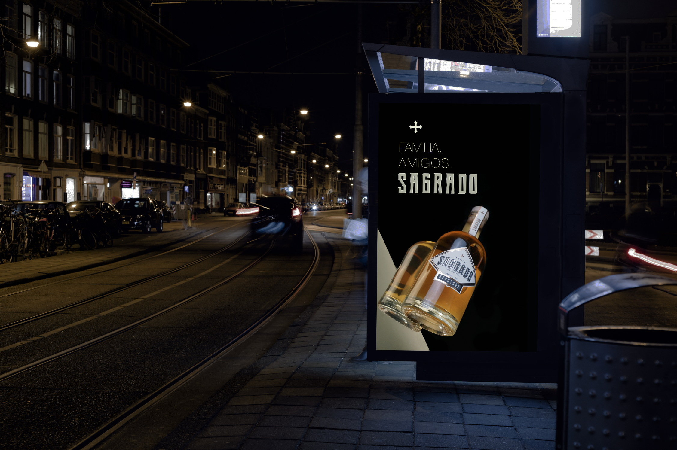
I built my concept based on what I wanted to evoke in the consumer; to transport them to the place that tequila represents, and then finding a name that will tie the concept and vision together.
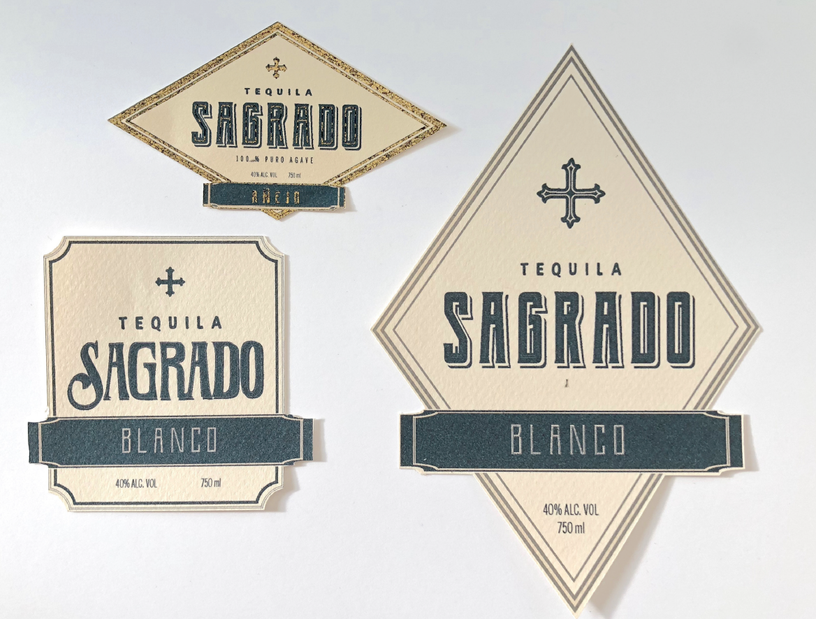
SAGRADO means sacred in Spanish. Drinking a high-quality handcrafted tequila of that kind is usually saved for a special occasion or to enjoy after a long day at work.
The focus is on the moment and in creating those “sacred” moments, by celebrating, sharing, or just enjoying it alone.


For the visual identity, I went for the old Spanish colonial conquistador type of look, which feels quite appropriate for a handcrafted, generational traditional tequila. I did choose Nordic-style bottles with natural wood cork tops to match the theme.

To differentiate the three varieties/flavors, I decided to experiment with heat reactive foil as it perfectly represents the names of the different tequila types (Blanco: silver, gold: Añejo, rose gold: Reposado), for the front/back labels, as well as the top ones.
The use of the Sagrado wordmark and symbol as the representing element to create consistency in the different design elements.
Below are some of the preliminary logo concepts